Overview
Led the designs for a suite of tools managing on-demand music catalogs. The goal was to provide in few weeks the visual language and user flows for multiple new products in order to support content operation teams and to launch an on-demand music service for our 80M users. The project was so complex and huge for the product team that it was named Goliath.
“A beautiful UI that’s having a major productivity impact”
Challenges
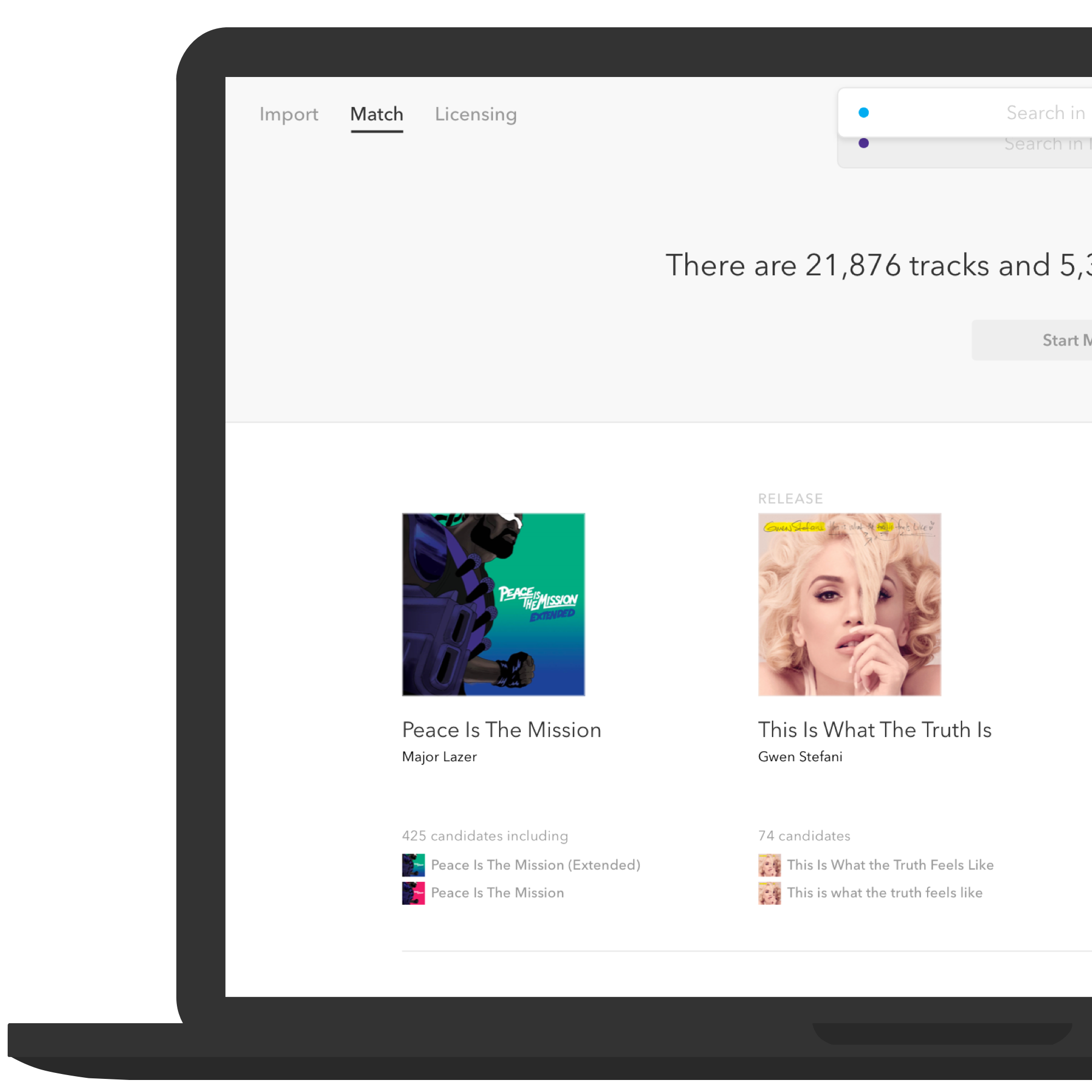
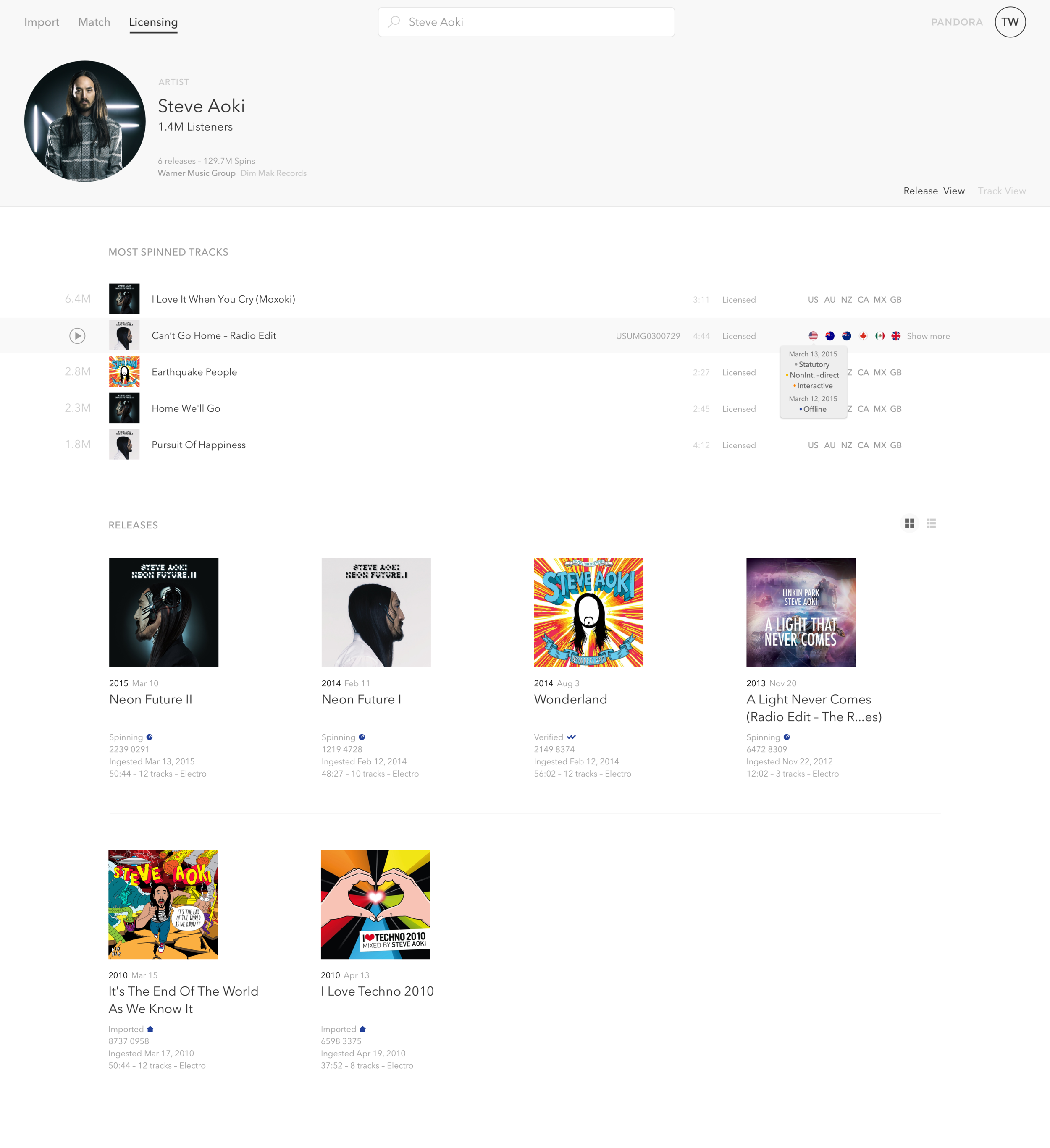
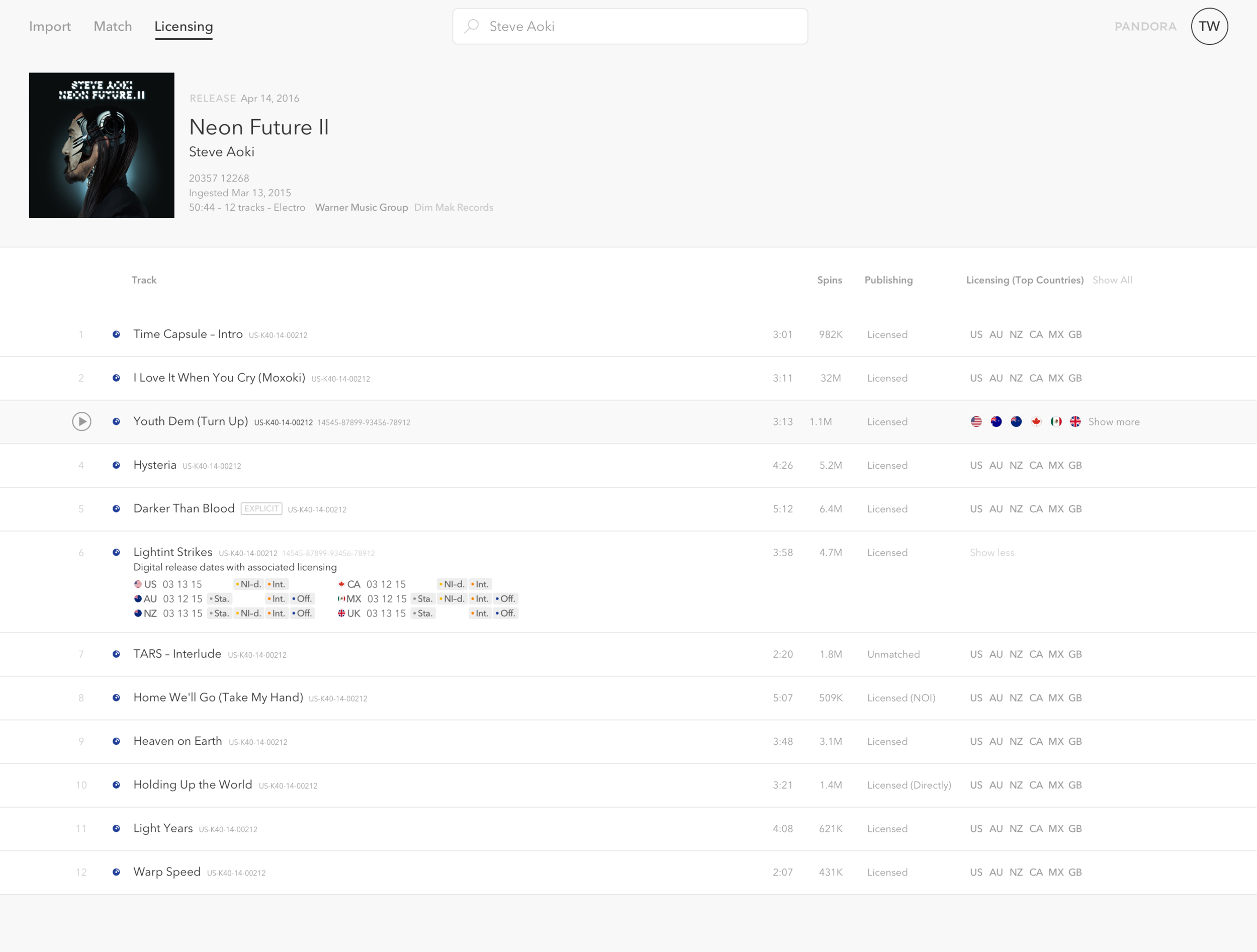
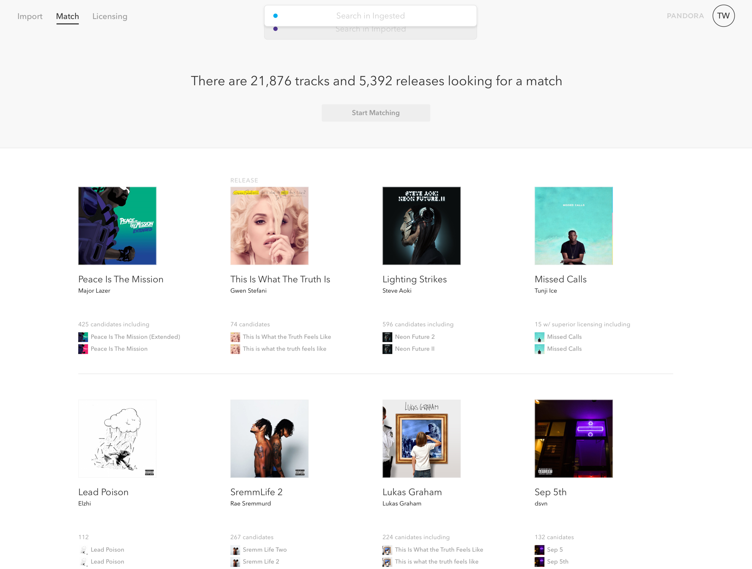
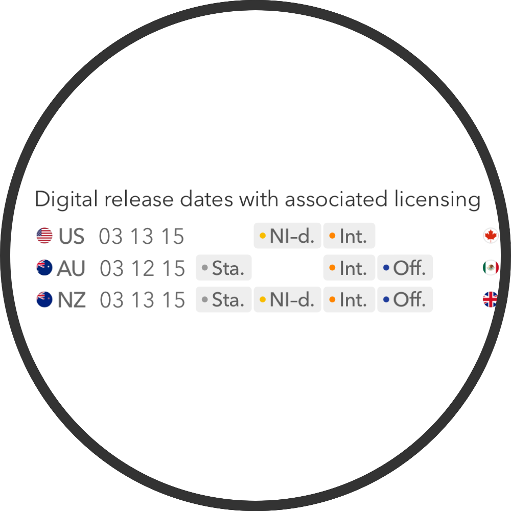
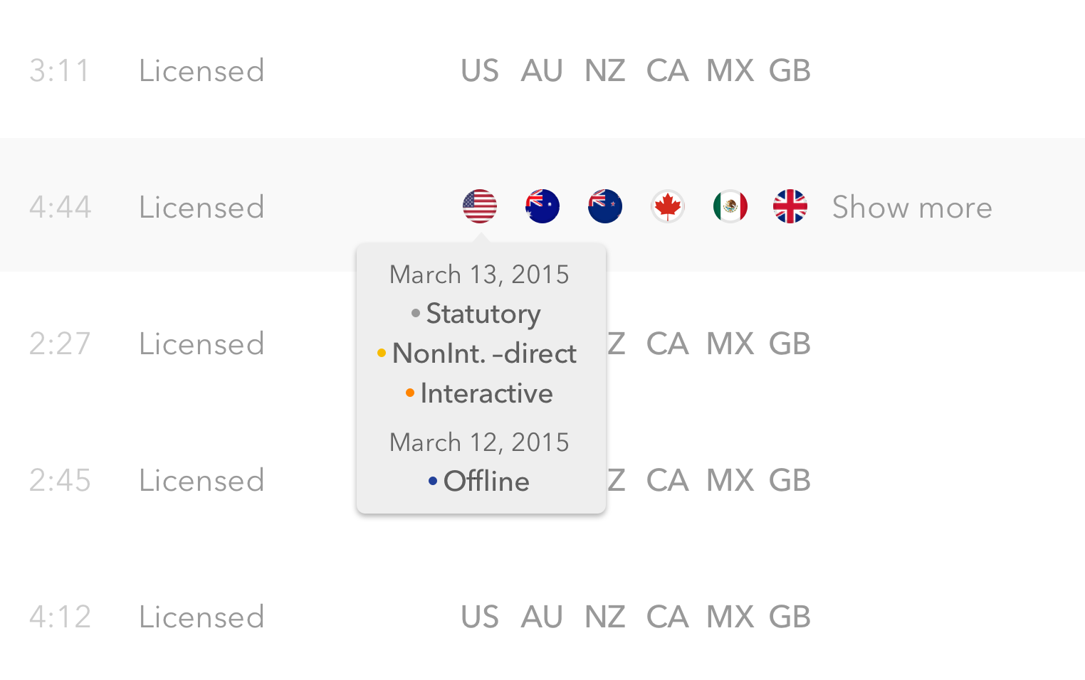
Content teams were discovering everyday new use cases – as all the pieces (data import, catalog ingestion, music analysis) were moving along at the same time. The designs had to manage complex data sets without being complicated to use. On international rights, a total of 2400 licensing combinations can be considered for an album of 10 tracks. How do you scan in few seconds in details such vast pools of data?
____
Color-Coded Badges With Matrix And Negative Space To Speed Up Scanning
____
Quick View On Hover
Work
Progressive disclosure techniques – hover cards, collapsed/expand states... – helped to make data quickly accessible without being too visible on the interface. White spaces created usability by giving information density a scansion – prioritizing user interface elements, guiding users. Color-coded badges organized as a matrix sped up information scanning. Product simplicity and clarity was favored over minimalism.